Update: 25th August 2016 We've fixed some bugs for various browsers so that the single card layout works. This should now work for Edge and Opera browsers.
Update: 12th April 2015 We've just added another new homepage format with a single large Card Style. This is in addition to our existing 2 and 3 column style grids. This should be useful for people who access the full site on a tablet who want a larger look and feel.
To give the new layout a try, click on the Configure Site link in the menu bar.
This will load the Site Configuration screen.
Select the option called Card and then close the config box down by either clicking the "X" at the top right or clicking anywhere outside of the box.
You should then have the new format when you visit the homepage again.
This has just been added so there might be some bugs, if you find any please let us know in the comments or via the Feedback form.
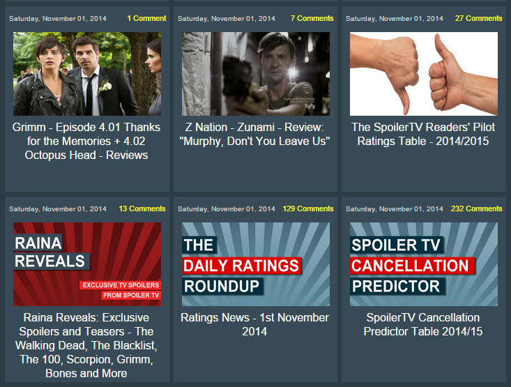
Update: 1st November 2014 We've just launched a new Grid Format with 3 Columns rather than 2. We've also added the ability to select not only the thumbnail type but also to select between light and dark themes.
We've also increased the number of articles on the homepage from 18 to 24.

Update: 31st October We're pleased to also announce a new Dark Theme in Beta Testing for those of you who prefer a darker theme.
You can set this on the "Configure Site" page (see below for details) and selecting Dark (Beta)
Original Post
Hey All,
As some of you know, here at SpoilerTV, we allow you to configure certain aspects of the site to suit your tastes. Eg the banner that is displayed, the article thumbnail type/size, the background colour.
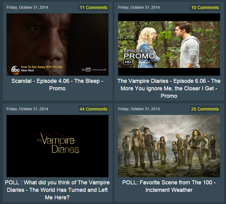
Well we're pleased to announce today the release of a new, more graphical grid layout of the site, imaginatively called "Grid". It provides the same number of articles on the homepage but does so in a more graphical way as well as removing some of the "clutter" such as post labels, author names etc as you can see below.

Each article has a nice image, along with the title displayed below. The comment count has been placed to make it easy to spot popular discussions.
To give the new layout a try, click on the Configure Site link in the menu bar.
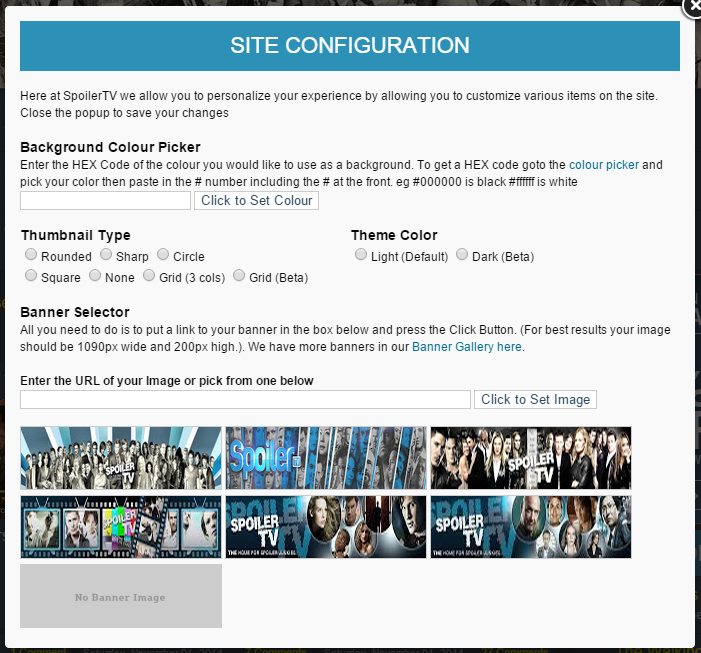
This will load the Site Configuration screen.

This will allow you to select the new "Grid (Beta)" format.
Once you have selected it, simply click on the "X" at the top right of the Screen or click anywhere outside of the popup screen. This will then refresh your browser and you should, hopefully!, see the new grid format.
You can at any point go back to the Site Configuration and change back to one of the other formats.
As we mentioned, this is very new so there will probably be little bugs here and there.
If you do find any issues/bugs, or have any thoughts/comments/suggestions etc we would love to hear them in the comments below.
We hope you enjoy this format and that some of you will prefer it over the more text based article list format that we currently have.
Known Issues
- None Currently
Update 1
- Image is now slightly smaller
- Image is now contained within coloured borders of the grid
- Increase space between each left | right item a little
- Fixed issue with very long titles overlappying out side of the grid
Update 2
- Increased the top border
- Made the comment count fit better within the article
- Added the Posted date.


