Yerk, I hate it. It looks like amateur work, all blur and I hate the colors.... The hands were a good idea but they should have reached higher than their hips at least, and be less.... redish. Not fan, but hey, as long as the boys are on it it'll do ^^.
Just horrible. Reusing last year promo pics and badly photoshoping it into something blurry and no-theme-related. What a surprise. All money spent on Arrow and Flush, SPN poster probably created by someones middle-school kid for free. Who cares about 10-years old TV show.
It sucks that they're reusing the same photoshoots, but I really like the hands on top and bottom, and also that Mark got a more promnent appearence. I would've preferred to some Demon eyes though ;P
Yes, the reaching hands were a great idea but the four characters are too pale - their faces should be more deeper flesh-tones to stand out more. I agree the reds are too red and the blues are too pale; the 'Heaven Hands' should show up better. The overall proportions of the characters seem better than the S9 poster but the S9 poster was more intriguing.
It's baffling, because they have people that can do good work. I mean just look at the Supernatural bag they gave away at this years Comic-Con. It's the best bit of official artwork the show has done.
Absolutely terrible poster. Most CW shows have terrible promotions though so this doesn't surprise me. Not exactly sure who over at the CW is responsible for this stuff but man their work is really bad and below amateur level at best. Must be a minimal wage position. :P
Its ok as far as posters go, you can tell they have used the same images as last season but they were good images and maybe there will be some more closer to the season premier. I'm sure with the 200th episode coming up and the retrospective episode there will be plenty of new images and interviews floating around eventually. Sam/Jared looks great so I cant complain. Not sure about the blue tinge Glad they didnt have the demon eyes as that wont be a season long lasting feature
I want more posters!!! I think the faces are from season 9. This is cool but I want them right now!!!!!!!! I want a poster with Dean very, very dark :P
What's happening this year with the graphic? All these promotional pics from almost every show and the Key-Art... are awful! So... I don't even know what word is best to decribe my thoughts.
NOTE: Name-calling, personal attacks, spamming, excessive self-promotion, condescending pomposity, general assiness, racism, sexism, any-other-ism, homophobia, acrophobia, and destructive (versus constructive) criticism will get you BANNED from the party.
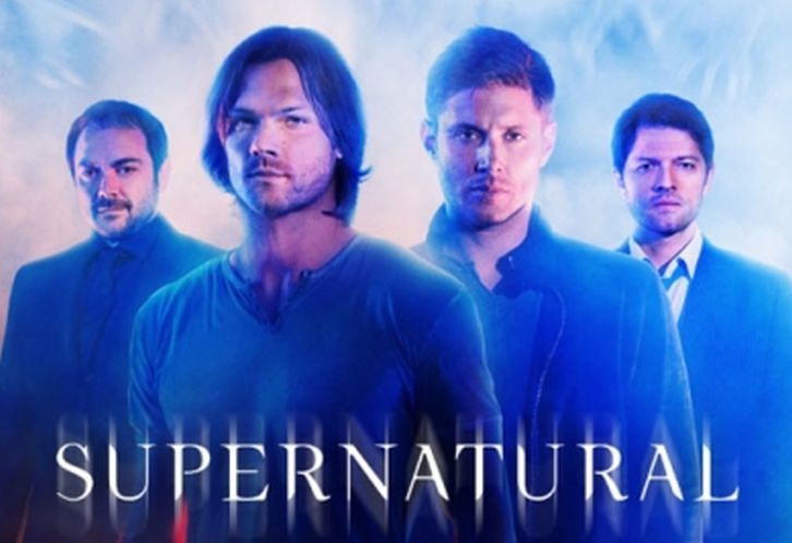


Oh wow at the hands reaching up. And I swear this is the same photoshoot again, just altered. I know those pictures of J2! You can't fool me.
ReplyDeleteEh. The season 9 poster was 10x better. :)
ReplyDeleteCW should really hire some new people for the creative department.
ReplyDeleteA recycled and badly photoshopped Supernatural poster, what a surprise.
ReplyDeleteThey really should just let the fans do it if they can't do a decent job.
It's ok, nothing fancy but it's nice. I liked the S9 poster better.
ReplyDeleteYerk, I hate it. It looks like amateur work, all blur and I hate the colors.... The hands were a good idea but they should have reached higher than their hips at least, and be less.... redish.
ReplyDeleteNot fan, but hey, as long as the boys are on it it'll do ^^.
I could whip up something better in five minutes. It pains me to know someone is getting paid for this.
ReplyDeleteThey gave all their skills to last season's poster/promo pics . I expected demon!Dean . This is really bad .
ReplyDeleteJust horrible. Reusing last year promo pics and badly photoshoping it into something blurry and no-theme-related. What a surprise. All money spent on Arrow and Flush, SPN poster probably created by someones middle-school kid for free.
ReplyDeleteWho cares about 10-years old TV show.
Its good enough :)
ReplyDeleteI actually really like this. The angelic light behind them is amazing!
ReplyDeleteIt sucks that they're reusing the same photoshoots, but I really like the hands on top and bottom, and also that Mark got a more promnent appearence. I would've preferred to some Demon eyes though ;P
ReplyDeleteWell they used the same photos from seasons 6-8. They have a new batch with season 9, so of course they are going to use them.
ReplyDeleteLove supernatural and Season 10 is going to be great but i love the fan made posters of season 10 compared to this one, like this one!
ReplyDeleteCould have been better but im so excited for the new season i need my boys back badly
ReplyDeleteMeh...incredibly blah and where are the new cast photos fans were promised weeks ago?!
ReplyDeleteYes, the reaching hands were a great idea but the four characters are too pale - their faces should be more deeper flesh-tones to stand out more. I agree the reds are too red and the blues are too pale; the 'Heaven Hands' should show up better. The overall proportions of the characters seem better than the S9 poster but the S9 poster was more intriguing.
ReplyDeleteIt's way better than last year's, IMO, at least.
ReplyDeleteIt's baffling, because they have people that can do good work. I mean just look at the Supernatural bag they gave away at this years Comic-Con. It's the best bit of official artwork the show has done.
ReplyDeleteSeems like after the endless flash promotion,they have nothing left for other shows!
ReplyDeleteAbsolutely terrible poster. Most CW shows have terrible promotions though so this doesn't surprise me. Not exactly sure who over at the CW is responsible for this stuff but man their work is really bad and below amateur level at best. Must be a minimal wage position. :P
ReplyDeleteI dont think thats an actual interpretation of how the season is going to be though so...
ReplyDeleteIts ok as far as posters go, you can tell they have used the same images as last season but they were good images and maybe there will be some more closer to the season premier. I'm sure with the 200th episode coming up and the retrospective episode there will be plenty of new images and interviews floating around eventually.
ReplyDeleteSam/Jared looks great so I cant complain.
Not sure about the blue tinge
Glad they didnt have the demon eyes as that wont be a season long lasting feature
I want more posters!!! I think the faces are from season 9. This is cool but I want them right now!!!!!!!! I want a poster with Dean very, very dark :P
ReplyDeleteI didn't even notice the "Heaven hands".
ReplyDeleteWhat's happening this year with the graphic? All these promotional pics from almost every show and the Key-Art... are awful! So... I don't even know what word is best to decribe my thoughts.
ReplyDeleteJA said it was a fan-art. How sad is that :)
ReplyDeleteThey're so faint - very hard to see, but there is at least two indistinct 'hands', one hand on each side.
ReplyDeleteJensen mentioned during the Nerd HQ panel that it was fan art. :)
ReplyDeleteI just looked the bag up, that was really good artwork...hell they should have made that the promo poster.
ReplyDeletei know what your saying i was saying i like the fans posters this season better!
ReplyDeleteThis poster sucks! It's flat out horrible! It's blurry and badly photoshopped!
ReplyDelete